Yesterday°
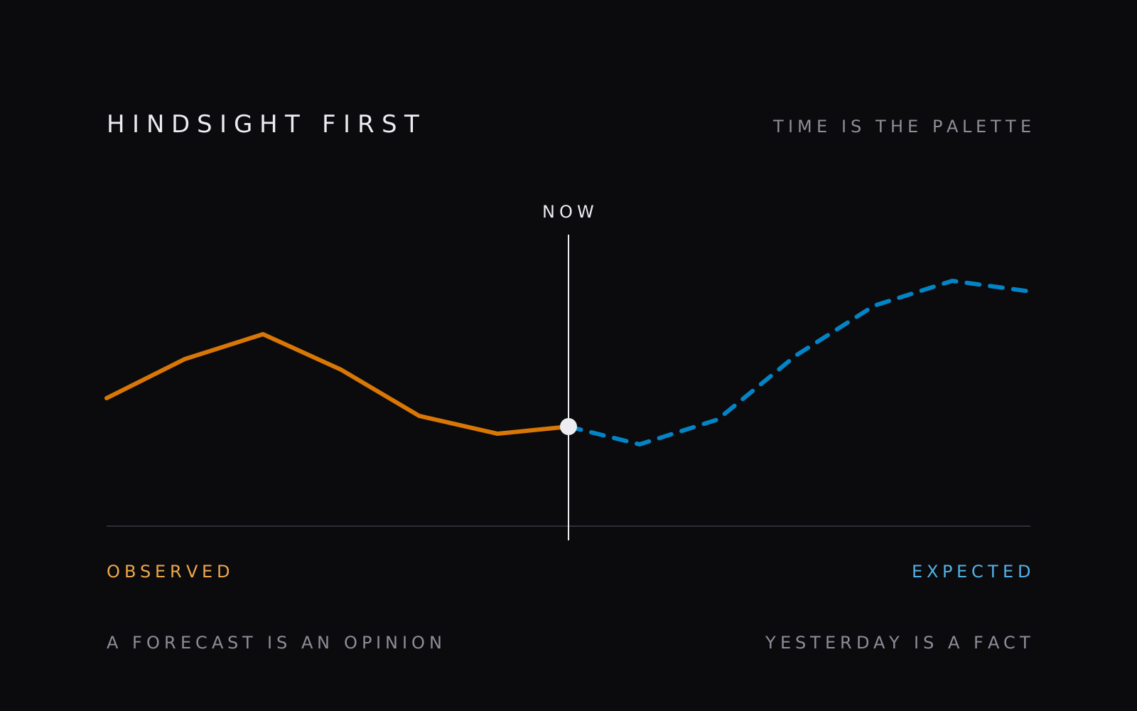
Yesterday° is a weather site that opens on the temperature that already happened and files the forecast under Foresight. I colored the site by time, amber for what was observed and blue for what is only expected.
- Data visualization
- Information design
- Open data
What it is
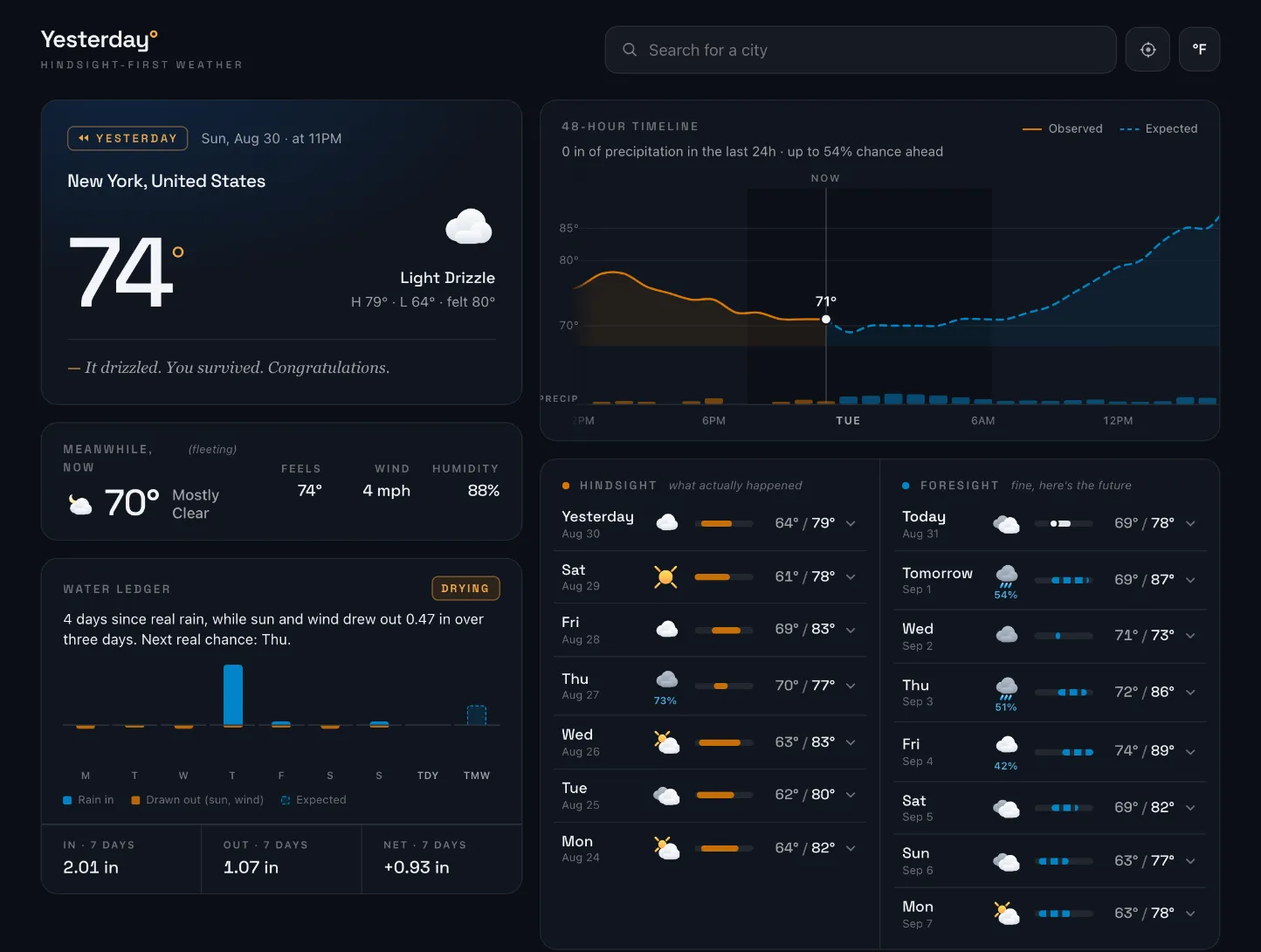
Yesterday° is a weather site that opens on yesterday’s weather. The first temperature on the page is the one that already happened. The present gets a thin strip labeled “Meanwhile, now (fleeting)”, and the forecast is filed under Foresight and marked expected.
The site began as an Apple Weather clone. Fourteen minutes after the first commit, I turned it around as a joke, and nine commits later I stopped treating it as one, because the useful part had surfaced. The recent past answers questions a forecast can’t, such as whether the ground is still holding water, what the sun and wind drew back out, and whether last night froze. All of that is on the record.
How it works
Everything runs against Open-Meteo with no key and no server of my own. One request per load carries ten past days and eight forecast days, so the two columns and a seven-day water ledger all come out of a single round trip. There are no API routes and no environment variables.
Time is the palette
Amber marks what happened and blue marks what might happen. White marks the instant between the two, and it appears once, as a divider. That encoding runs across five surfaces: the timeline’s two lines, the day rows’ range bars, the water bars, the radar scrubber, and the social card.
Hue alone wouldn’t carry the distinction, so every phase is also a dash pattern. Lines are solid for observed and dashed for expected, on every surface. Someone who can’t separate the two colors still reads the chart, and the design stops depending on my contrast math being right.
Each accent has two values. #D97706 is the mark color for a 2px chart stroke,
and #F0A84B is the text color for chips and links. A hairline and a 10px
label need different contrast off the same hue, and collapsing them to one
value cost legibility at one end or the other.
The canvas is flat ink with hairline panels. There is no frosted glass, no sky gradient, and no full-bleed photography, because the page is a document rather than a window. I allowed one exception. The hero carries a radial glow tinted by the condition, and that is the only place where the weather colors a surface.
The water ledger
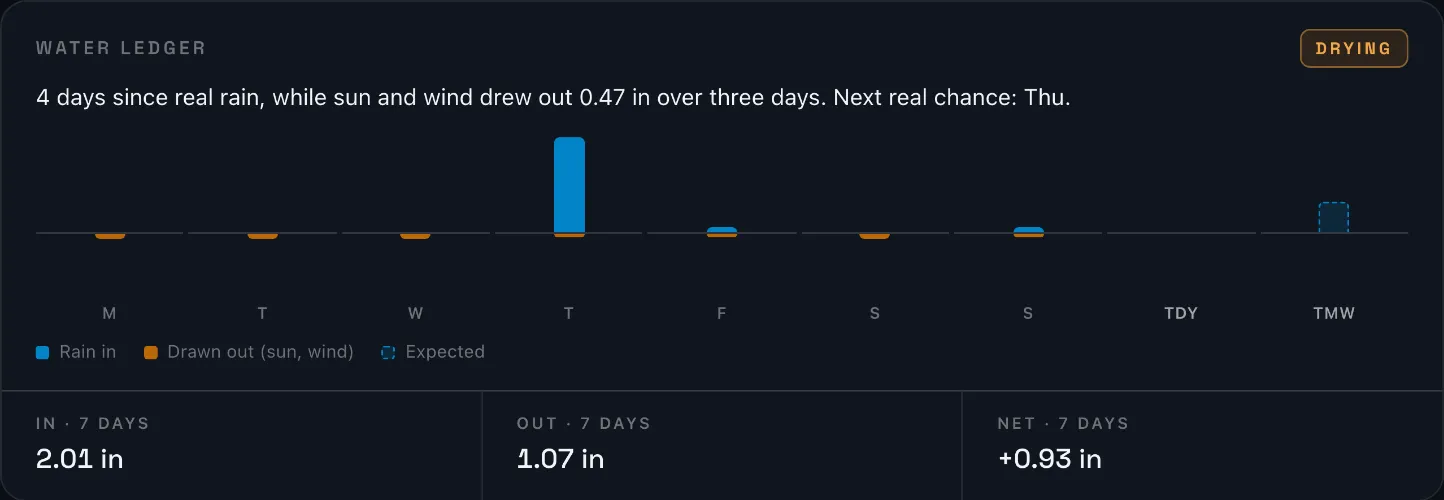
The debit comes from a field Open-Meteo publishes and almost nobody surfaces. Reference evapotranspiration folds heat, sun, wind, and humidity into a single figure for water drawn back out of the ground. That is what turns “it rained 10mm” into “the ground is 6mm ahead”, and only the second one answers whether the garden needs watering.
The verdict runs in millimeters and degrees Celsius, whatever the display says, so switching to Fahrenheit can’t change whether the ground reads Drying or Parched. The same rule governs the consequence flags, down to the detail that Open-Meteo returns snowfall in inches under imperial units and centimeters under metric.
How I built it
The usual radar source keeps only two hours of frames, so it can’t show yesterday. The replay instead pulls NOAA NEXRAD out of the Iowa Environmental Mesonet’s time-indexed archive, which reaches back years, and the forecast chapter reads HRRR simulated reflectivity. There is no map library. Projection and tile addressing are about forty lines of code.
Rather than trust each provider’s palette, I re-ink every frame pixel by pixel. A function recovers a 0-to-1 intensity from hue and lightness, then remaps that intensity through one amber ramp.
What I learned
The single amber ramp is where I broke my own rule. I had colored forecast echoes blue, in keeping with the color system, and the result was consistent and wrong. The map no longer showed whether tomorrow’s cell was heavier than yesterday’s, because the two chapters were drawn in different inks. The last commit in the repo gives every chapter the same ramp and moves the phase signal into the chrome, where the scrubber runs solid amber up to now and dashed blue after it.
Two of the six data sources have degraded since I built the site. The basemap provider now watermarks keyless tiles, and the fallback radar’s free API is deprecated. The weather data, which the whole site depends on, still comes back keyless.