Adventure Planner
Adventure Planner is a personal hiking planner that verifies trail conditions live and shows its sources. I built the graph, the engine, the evals, and the app end-to-end with a fleet of Claude agents.
- Design systems
- AI
- Research
What it is
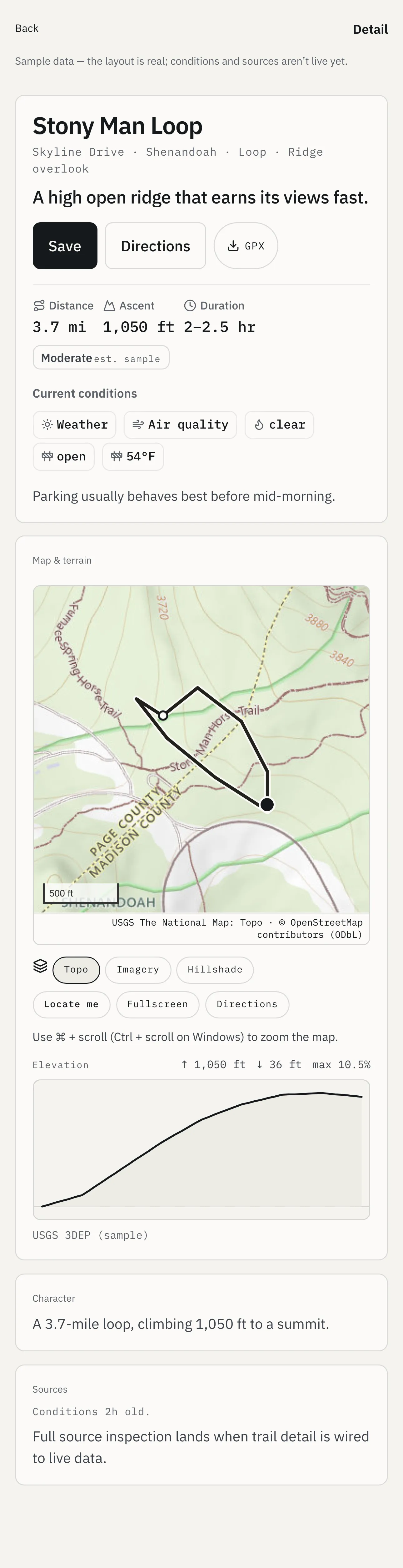
I hike, and I wanted a planner whose claims I could check. Adventure Planner answers one question about a particular trail: is this hike a good idea right now? The trail data underneath it is open-source, from OpenStreetMap, the US Geological Survey, the Forest Service, and the Park Service. That data lands in a Neo4j graph database, which stores the links between trails as records in their own right. A background job ranks the trails there. Conditions are verified live at the moment you ask, and the answer comes back as go, marginal, or no-go, with a source, a timestamp, and a confidence on every fact behind it.
How it works
Ten rules govern the build. The first is that every user-facing fact is backed by a live call, and anything unverifiable renders as flagged, never fabricated. The second is that confidence and desirability stay on separate axes and never collapse into a single score.
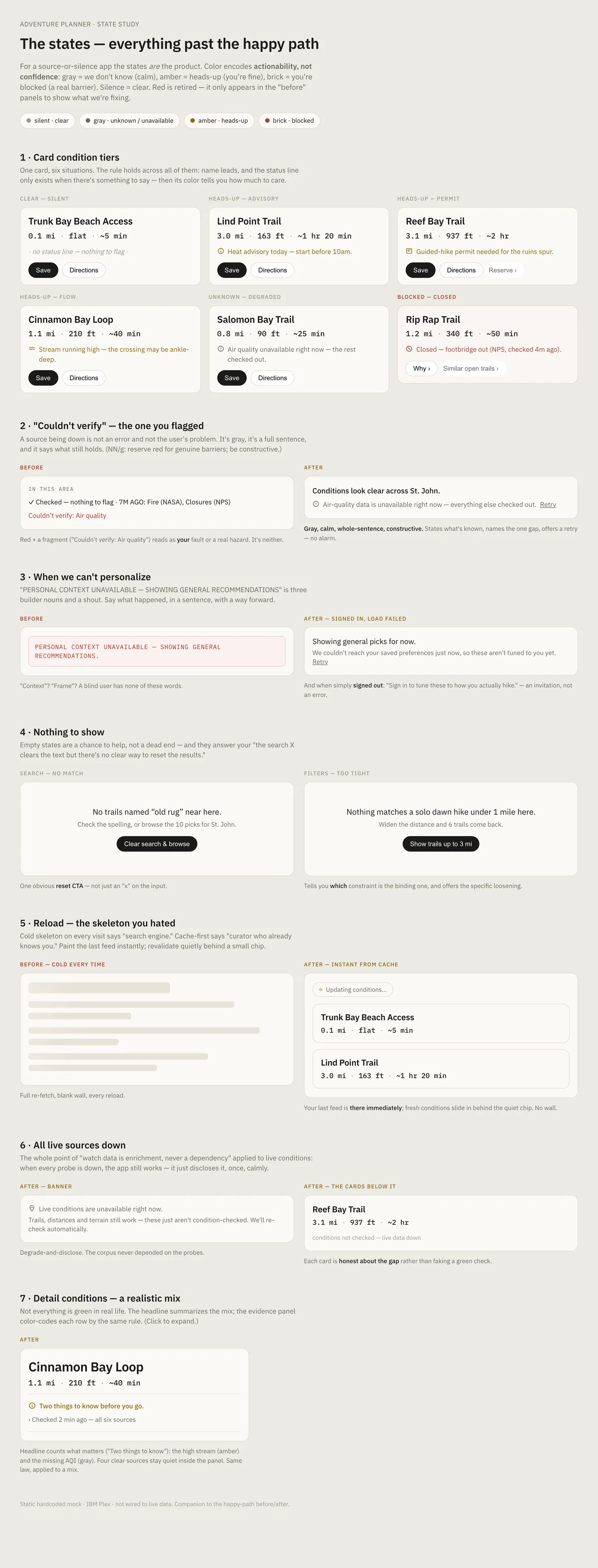
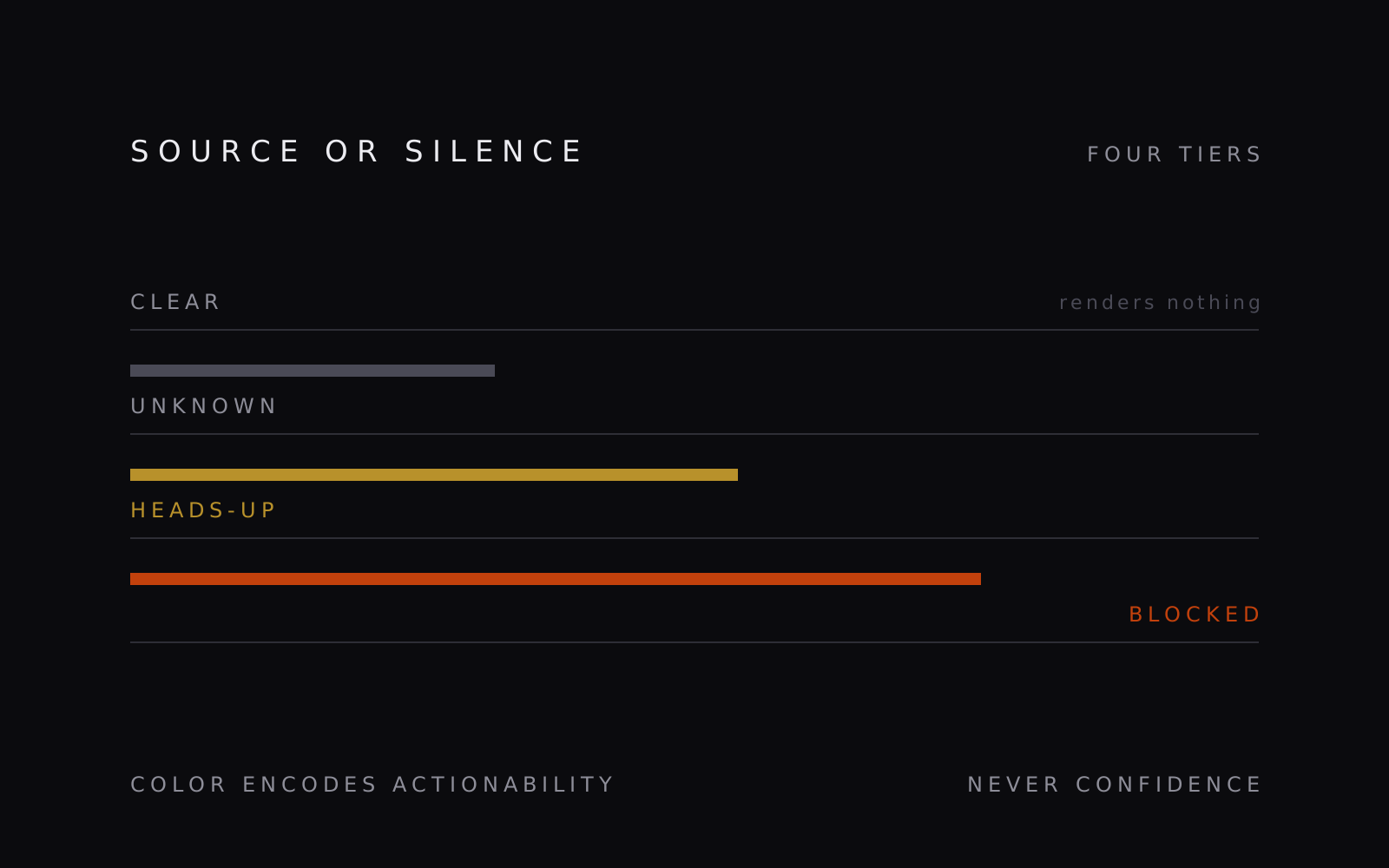
Four tiers carry every condition. Clear renders nothing, unknown is gray, heads-up is amber, and blocked is the only tier that gets the accent color, because color encodes actionability. A missing feed never turns red. That one rule rewrote most of the system copy. “Couldn’t verify: Air quality” became “Air-quality data is unavailable right now, everything else checked out,” set in gray, with a retry. A test now fails the build when builder words like context, frame, or fetched reach a user-facing string.
How I built it
Before building, I reviewed 22 outdoor apps and 33 higher-stakes domains. The outdoor apps mostly present undated, unsourced data as current truth. The higher-stakes fields, among them aviation, avalanche forecasting, clinical decision support, and search and rescue, had converged on the same four moves. Score the conditions, but leave the decision to the person. Treat safety as a perishable state that expires. Count corroboration only when the sources are independent. Show restraint, because the expensive failure in those fields is burying the critical fact under true but trivial ones. All four became constraints on the design.
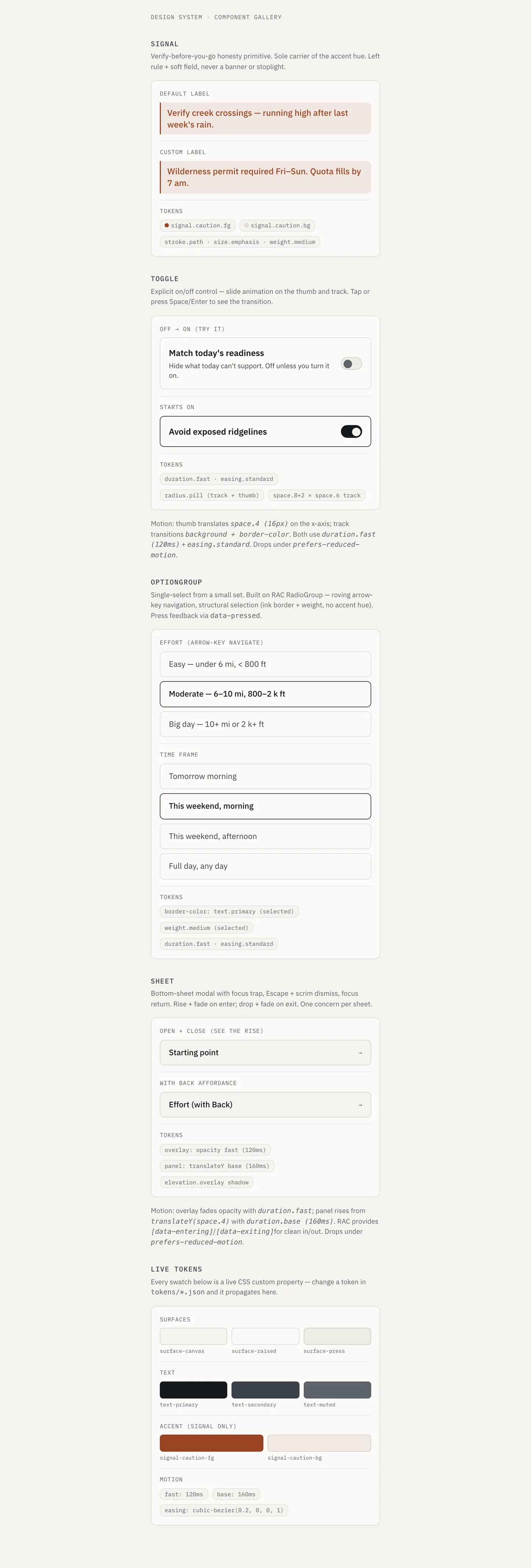
The interface is a small component library built from design tokens. Every component is typed against a frozen contract file, which let several agents build screens in parallel without colliding. Contrast, type scale, the silence glyph, and the copy voice each have a test, so the design system fails the build when it drifts, the same way the types do.
An eval harness runs against the engine on every change, and it asks two questions. Does every surfaced fact carry a source and a timestamp? Does a trail the guardrails blocked ever reach the feed?
I built the whole thing with a team of Claude agents working under a written operating model. A product owner holds the roadmap and an integration steward owns merges. Each disposable builder takes one brief, works in its own checkout of the repository, opens one pull request, and is then discarded. The grounding rules came from failures. One agent diagnosed an already-fixed bug from a working copy 21 commits stale, so counts and status now live only in a generated file that CI checks for drift.
The system has run end-to-end on a hosted stack, over a corpus of 2,206 trails across Shenandoah National Park and the George Washington and Jefferson National Forests. That deployment is down now, its free-tier database reclaimed after a stretch of inactivity, so the screens here run on the app’s sample store. Three things are left before anyone else can use it: authentication, trip-history import, and the last guards on the pipeline that merges duplicate records of the same trail from different agencies.
What I learned
The happy path took a few days. Everything past it took months, and nearly all of that time went into the states where the system knew less than the person asking needed it to know.
Two decisions turned out to be portable. Keeping confidence and desirability on separate axes stops a system from turning a guess into a recommendation. Encoding actionability in color, rather than severity, keeps a broken data feed from reading as a hazard. Both would apply to any system that reports conditions it doesn’t measure itself.